Home > Case studies > Perast
Old town Perast caterers association
We are truly proud to boost our country’s economy whenever we have the chance. One of many ways to do it is to help local brands to become more visible and ass kicking.
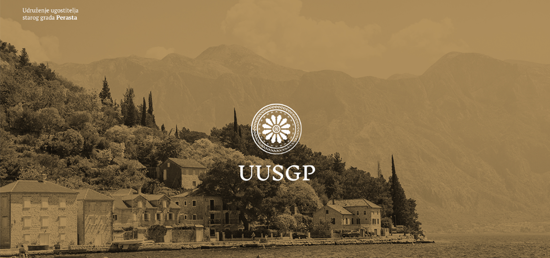
Old town Perast caterers association helps promote Perast as an elite tourist destination, also through developing touristic and municipal infrastructure. One of those projects is “Perast – a city without cars”. Other than that, these fellas are sharing the experiences and building relationships with those cities in Europe and all around the world – who are successful in cashing in on their cultural-historical heritage.
One of the organization’s goals is to teach locals about cultural heritage’s advantages and boosting cultural tourism. The association is involved in preparation and implementation of various projects, funded by domestic and foreign donors.

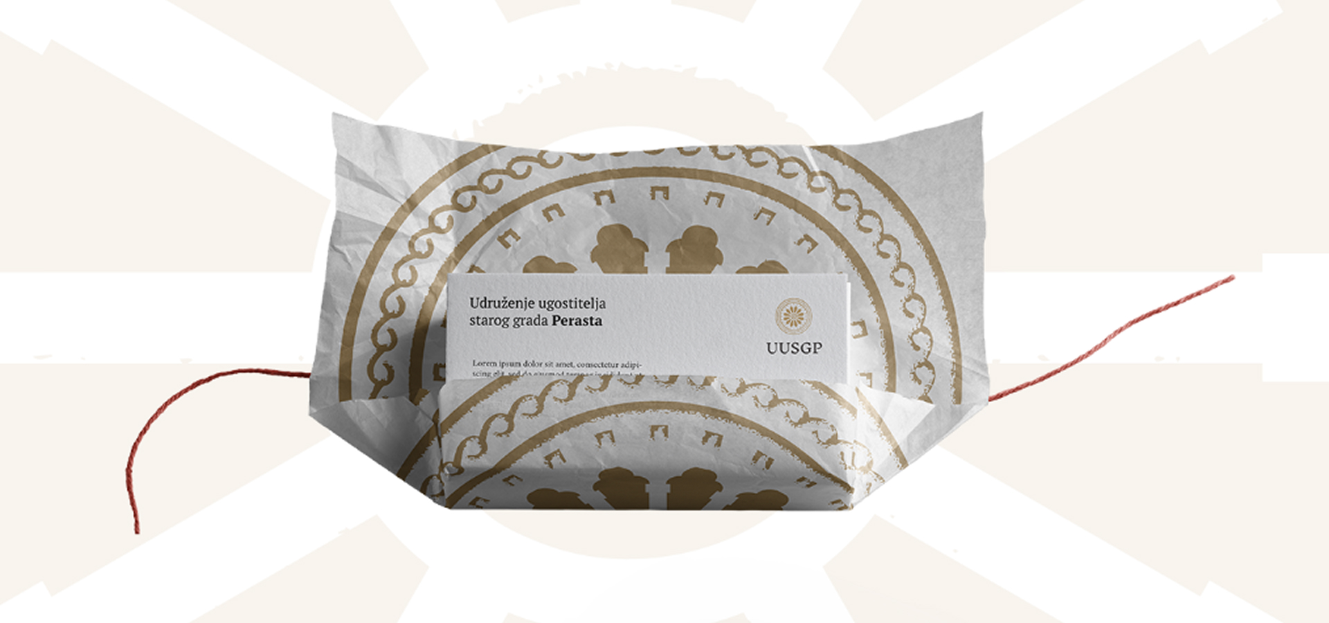
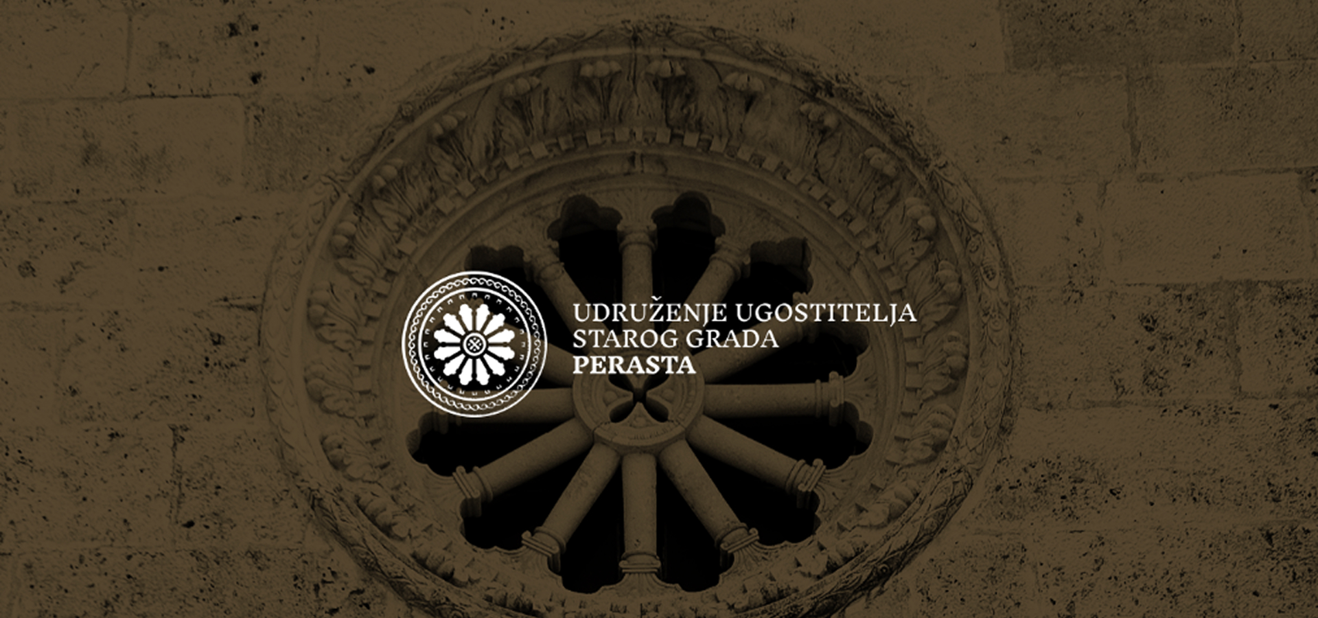
The main motif for our logo proposition was a rosette from a nearby church on the island of the Lady of the rocks. This monument is the true representative of the cultural heritage of worldwide-famous Boka bay.
Our solution, somewhat modernly formed, in synced lines calls for unity, gathering and protection. Rich in details, this logo is suitable for ornamental purposes and other graphic applications.
We set the team of 10 of our brightest and synced them with the goal of delivering contemporary, high-end, high quality, up to the standard – product. Our first aim was to keep the existing platform alive and stop it from crashing every once in a while. We started with the track record a.k.a – documenting the work which also serves as a foundation for the future steps. With it, the payment system was on the brink of collapse, too, so we had to implement a new one. By stabilizing the platform, we got to the point of making a new environment in Docker. From that point forward ideas kept coming. We made a decision to move to the cloud. Azure gave us the opportunity to have an open infrastructure. And then it was time to start polishing. Our UX team got its hands on changing the looks of homepage, on-boarding, new notifications flow, comments and FAQ redesign…

The association helps Boka bay to become sustainable and to preserve its most valuable resource – its natural beauty. Symmetry represented in the logo, also emphasises coherent organization.

REGROW – Montenegrin Blue Growth clusterVisual identity for the first Montenegrin cluster of blue growth, REGROW, dedicated to improving the…

Eman – Symbols intertwinedPremium interconnected“Simplicity is the ultimate sophistication” – a wise man once said. While we’re not nowhere near…

CasaViz - Make every estate digitally available.A startup on a mission to make all real estate digitally accessible and a…
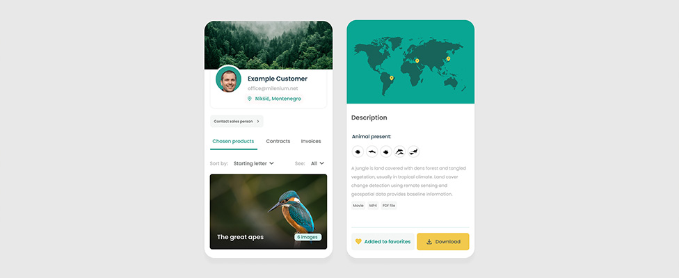
Wild Immersion - Development of sales performance showcase in just a few monthsWild Immersion’s mission is to raise public awareness…
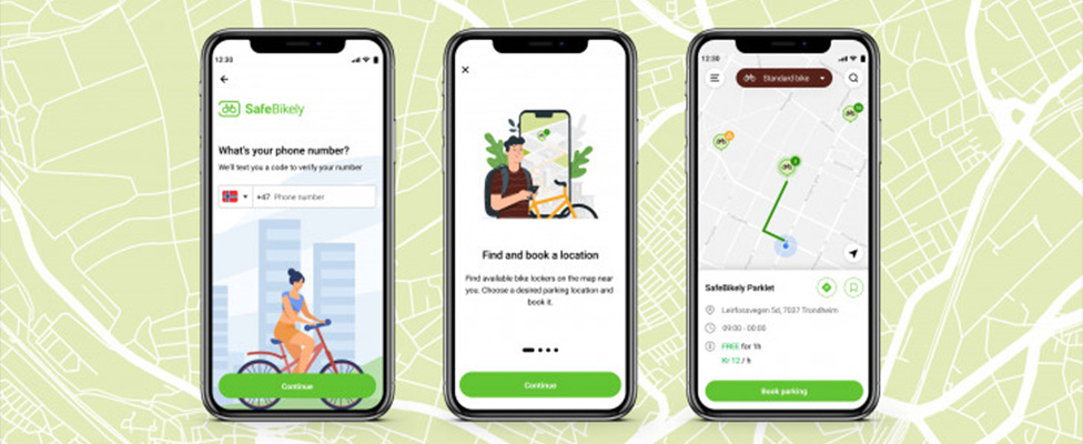
Safe Bikely - Lockers with a pinch of IoTDo you know that 3.5M bikes get stolen in Europe every year?…
Want to recieve our newsletter?
Find us at
China,
Shanghai
Germany,
Weingarten
Bosnia,
Tuzla
India,
Bangalore
Montenegro,
Podgorica

China, Shanghai
Germany, Weingarten
Bosnia, Tuzla
India, Bangalore
Montenegro, Podgorica
We use cookies and other tracking technologies to improve your browsing experience on our website, to show you personalized content and targeted ads, to analyze our website traffic, and to understand where our visitors are coming from.