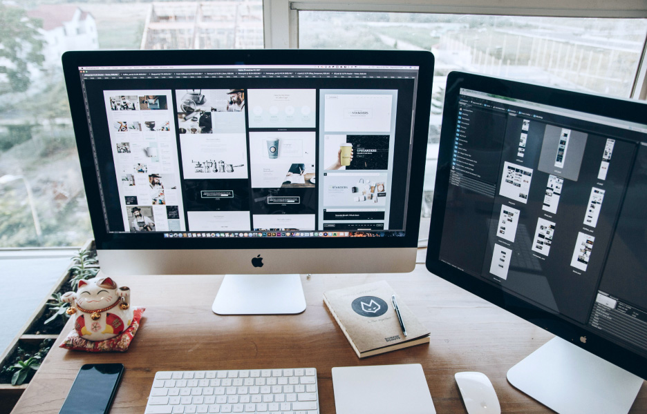
From wireframes to stunning interfaces
Design begins with wireframes—the blueprint for your product’s structure. We iterate on these concepts, refining layouts and interactions until they’re perfect. Once approved, we bring the designs to life with high-fidelity visuals that are polished, on-brand, and conversion-focused. Every detail, from typography to color schemes, is carefully considered to deliver a beautiful and functional experience.
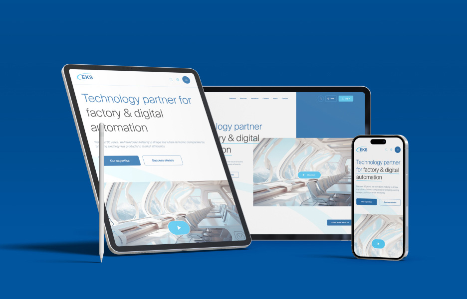
Mobile and web optimization
Today’s users interact with products across multiple devices, so consistency is key. We design responsive interfaces that look and feel flawless on desktops, tablets, and smartphones. By optimizing the experience for every screen size, we ensure your users enjoy seamless navigation and functionality anywhere, anytime. This boosts engagement and reduces friction across the board.


