Gestaltung von Benutzeroberflächen, die begeistern und überzeugen
Nutzerzentrierter design Ansatz
Im Mittelpunkt jedes großartigen Designs steht ein tiefes Verständnis Ihrer Nutzer. Wir beginnen damit, durch Forschung und Workshops die Bedürfnisse, Frustrationen und Verhaltensweisen der Anwender zu identifizieren. Dieser nutzerzentrierte Ansatz gewährleistet, dass wir Erlebnisse gestalten, die natürlich und intuitiv wirken. Wenn Ihr Produkt so funktioniert, wie Nutzer es erwarten, schafft das Vertrauen, Loyalität und langfristige Bindung.
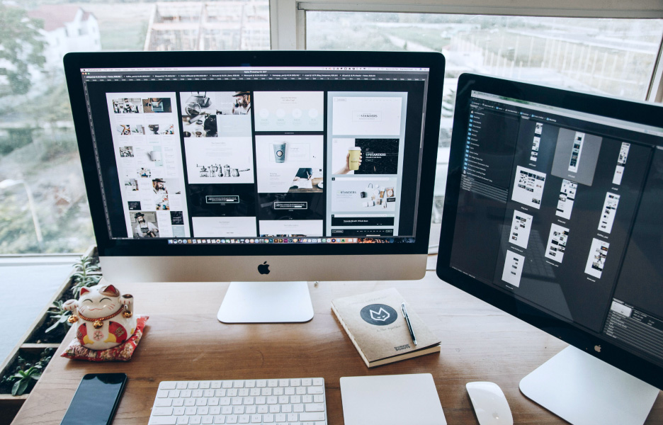
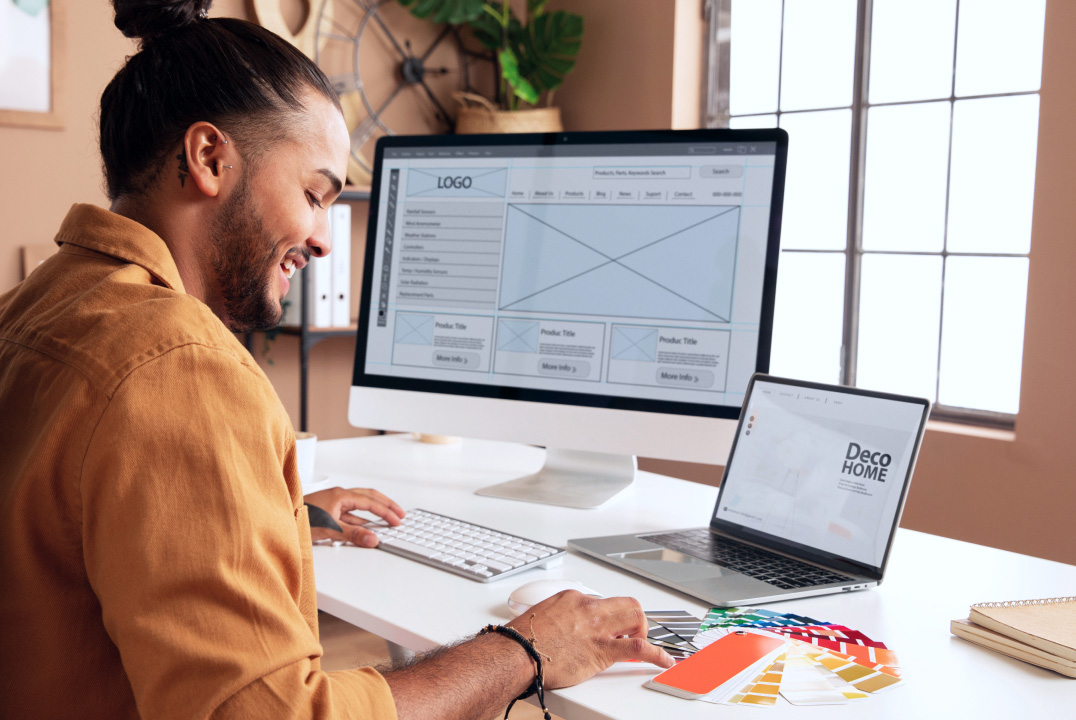
Von Wireframes zu beeindruckenden Interfaces
Design beginnt mit Wireframes – dem Grundriss für die Struktur Ihres Produkts. Wir arbeiten diese Konzepte iterativ aus, verfeinern Layouts und Interaktionen, bis sie perfekt sind. Nach Freigabe erwecken wir die Designs mit hochauflösenden Visualisierungen zum Leben, die poliert, markenkonform und auf Conversion ausgerichtet sind. Jedes Detail, von Typografie bis Farbgestaltung, wird sorgfältig berücksichtigt, um ein schönes und funktionales Nutzererlebnis zu schaffen.
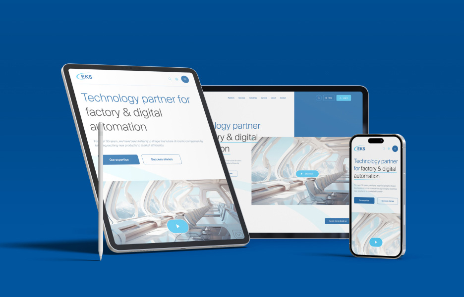
Mobile und web optimierung
Heutige Nutzer interagieren mit Produkten auf verschiedenen Geräten – deshalb ist Konsistenz entscheidend. Wir gestalten responsive Interfaces, die auf Desktops, Tablets und Smartphones einwandfrei aussehen und sich ebenso bedienen lassen. Durch die Optimierung für alle Bildschirmgrößen sorgen wir dafür, dass Ihre Nutzer jederzeit und überall eine nahtlose Navigation und volle Funktionalität erleben. Das steigert die Nutzerbindung und minimiert Reibungsverluste.
Nutzerzentrierter design Ansatz
Im Mittelpunkt jedes großartigen Designs steht ein tiefes Verständnis Ihrer Nutzer. Wir beginnen damit, durch Forschung und Workshops die Bedürfnisse, Frustrationen und Verhaltensweisen der Anwender zu identifizieren. Dieser nutzerzentrierte Ansatz gewährleistet, dass wir Erlebnisse gestalten, die natürlich und intuitiv wirken. Wenn Ihr Produkt so funktioniert, wie Nutzer es erwarten, schafft das Vertrauen, Loyalität und langfristige Bindung.
Von Wireframes zu beeindruckenden Interfaces
Design beginnt mit Wireframes – dem Grundriss für die Struktur Ihres Produkts. Wir arbeiten diese Konzepte iterativ aus, verfeinern Layouts und Interaktionen, bis sie perfekt sind. Nach Freigabe erwecken wir die Designs mit hochauflösenden Visualisierungen zum Leben, die poliert, markenkonform und auf Conversion ausgerichtet sind. Jedes Detail, von Typografie bis Farbgestaltung, wird sorgfältig berücksichtigt, um ein schönes und funktionales Nutzererlebnis zu schaffen.
Mobile und web optimierung
Heutige Nutzer interagieren mit Produkten auf verschiedenen Geräten – deshalb ist Konsistenz entscheidend. Wir gestalten responsive Interfaces, die auf Desktops, Tablets und Smartphones einwandfrei aussehen und sich ebenso bedienen lassen. Durch die Optimierung für alle Bildschirmgrößen sorgen wir dafür, dass Ihre Nutzer jederzeit und überall eine nahtlose Navigation und volle Funktionalität erleben. Das steigert die Nutzerbindung und minimiert Reibungsverluste.
Unsere Prozesse
Unsere Prozesse
Wir analysieren Ihre Zielgruppe, Wettbewerber und Ziele, um die Grundlage für Ihre Designstrategie zu schaffen.
Unser Team erstellt Wireframes und interaktive Prototypen, um die Produktstruktur zu visualisieren und zu validieren.
Wir gestalten beeindruckende, benutzerfreundliche Interfaces, die Ihre Markenidentität widerspiegeln und Ihre Zielgruppe begeistern.
Wir testen, sammeln Feedback und verfeinern die Designs, um sicherzustellen, dass sie den Erwartungen der Nutzer und den Zielsetzungen entsprechen.
Usability testing
Mehr anzeigen
Tools die wir verwenden
Wir haben nie die Lust am Entdecken und Lernen verloren – wenn sich also etwas Besseres ergibt, sind wir sofort dabei.
Wir verwenden Cookies und andere Tracking-Technologien, um Ihr Nutzungserlebnis auf unserer Website zu verbessern, personalisierte Inhalte und gezielte Werbung anzuzeigen, den Website-Traffic zu analysieren und zu verstehen, woher unsere Besucher kommen.
Funktional
Immer aktiv
Diese Cookies werden verwendet, um Ihnen ein personalisierteres Nutzungserlebnis auf unserer Website zu bieten und sich an Ihre Einstellungen zu erinnern, die Sie bei der Nutzung unserer Website treffen.
Einstellungen
Die technische Speicherung oder der Zugriff ist für den legitimen Zweck erforderlich, Präferenzen zu speichern, die nicht vom Abonnenten oder Benutzer angefordert wurden.
Statistiken
Diese Cookies werden verwendet, um Werbung anzuzeigen, die basierend auf Ihrem Surfverhalten wahrscheinlich für Sie von Interesse ist.Die technische Speicherung oder der Zugriff, der ausschließlich zu anonymen statistischen Zwecken verwendet wird. Ohne eine Vorladung, die freiwillige Zustimmung Ihres Internetdienstanbieters oder zusätzliche Aufzeichnungen Dritter können die zu diesem Zweck gespeicherten oder abgerufenen Informationen in der Regel nicht dazu verwendet werden, Sie zu identifizieren.
Marketing
Die technische Speicherung oder der Zugriff ist erforderlich, um Nutzerprofile zu erstellen, Werbung zu versenden oder den Nutzer auf einer Website oder über mehrere Websites hinweg zu ähnlichen Marketingzwecken zu verfolgen.

